Learn a New Digital Tool Without Getting Lost
A self-paced way to explore unfamiliar software: begin with one real task, learn only the features it needs, and leave useful notes for next time.
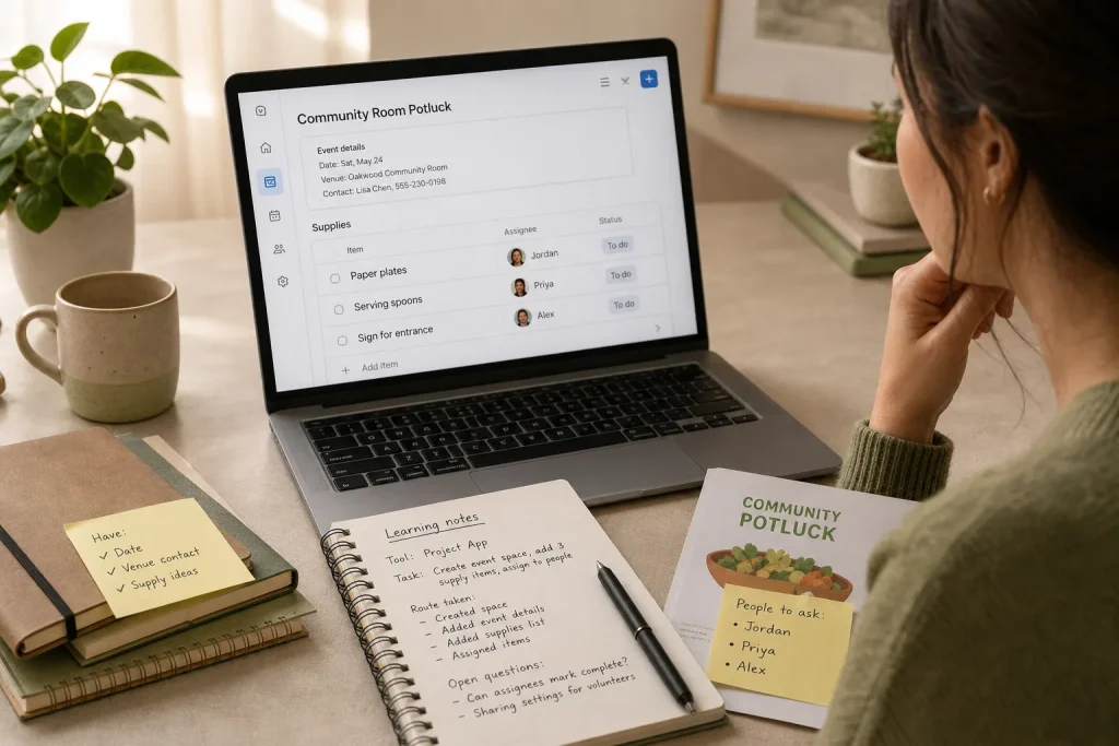
Mara opens a new project-management app to prepare a small neighborhood event. She wants one place for the venue confirmation, a list of supplies, and a note about who will bring them. Instead, the screen offers boards, timelines, automations, templates, dashboards, and a bright button inviting her to start a trial. The task is simple; the interface is not. Her best move is to close the tour, name the event, and find one useful place to put the next piece of information.
This is an invented, hypothetical situation, but the learning problem is familiar: unfamiliar software presents many possible routes before it reveals the route that matters. A self-paced plan can keep exploration attached to a real outcome. Rather than trying to understand the whole tool, Mara can complete one small task, notice which features help, and record enough to pick up where she left off.
Choose a task with a visible finish
Before clicking through menus, describe what you want the software to help you do. Keep the task small enough to finish in a sitting and concrete enough that you can tell when it is done. “Learn the project app” is too broad. “Create an event space, add three supply items, and assign each to a person” has a clear endpoint.
Mara sets a few boundaries. The event is a modest potluck at a community room. She already has the date, a venue contact, and a short list of supplies. She does not need ticket sales, a public website, a budget report, or automatic reminders. Those features may be useful for other events; they are not needed to make this first task work.
A useful task has three parts:
- A starting point: the information or material you already have, such as a document, a folder of photos, or a list of names.
- An action: what you want to do in the tool, such as organize items, edit an image, or schedule a message.
- A visible finish: what you should be able to see or use when the task is complete.
That last part matters. A finish might be a saved draft, a labeled set of files, a chart with the right categories, or a shared task list. It should be something you can inspect, not a vague feeling that you have “gotten the hang of it.”
If the task involves important or sensitive material, make a copy or use harmless sample content while learning. A tool’s undo button may not restore every change, and the first session is for exploration as well as progress. For work that affects account access, confidential information, or essential records, follow your organization’s rules and ask an appropriate support person when needed.
Set a boundary around exploration
New software rewards curiosity, but every invitation to click can pull you away from the task. Mara gives herself a short learning session and a narrow question: can she create a shared event space and enter the basic information? She postpones custom colors and advanced views. If the app cannot do the essential job without a complicated setup, that is useful to learn too.
First, she scans the screen for the main work area, the place to create something new, and any obvious help control. She does not open every menu. A quick orientation is enough to find a starting point. If an introductory tour appears, she reads only the parts that explain a control she needs now. She can return to the tour later if a real question arises.
Next, she creates a space called “Community Room Potluck” and adds a brief note with the date and venue contact. She looks for the simplest option that appears to hold work items: perhaps a board, list, or task area. The name of the feature is less important than whether it can contain the supplies and make them easy to find.
When several unfamiliar features seem plausible, she uses a small decision rule: try the least complicated one that can complete the task, and pause if the choice would be difficult to reverse. A view can often be changed later; sharing a workspace or inviting people may have broader consequences. Those decisions deserve more care than choosing a display style.
This boundary also keeps the session honest. Mara is not claiming mastery because she has clicked through a tour. She is asking a narrower question: did the tool let her store the event basics in a place she can locate again?
Learn only the features the task requires
With the event space open, Mara adds three items: paper plates, serving spoons, and a sign for the entrance. She looks for a way to assign each item to someone. If the app supports owners or assignees, she tries that feature. If it does not, she can write a person’s name in the item description and decide later whether another tool would be a better fit.
She then checks whether the list is readable without extra setup. Can she see each item and its owner? Can she mark an item complete or update it? Can she return to the event space without hunting through the app? These are not general product questions; they are tests of whether this particular task is workable.
When a control is unclear, Mara takes one small learning detour. She reads the label, opens the help panel, or searches the app’s own documentation for the feature name she sees. She avoids searching for a broad tutorial such as “how to use the whole app,” which is likely to introduce many tools unrelated to her immediate need. If help material uses different names from the interface, she notes the mismatch and tries the closest relevant control cautiously.
She also distinguishes a feature that is necessary from one that is merely available. A notification setting might be useful if volunteers need reminders, but the current task is to make a clear supply list. A dashboard might summarize several projects, but there is only one event. A template might save time on repeated events, but this is the first one. Leaving these options untouched is a learning decision, not a failure to explore.
Small checks help reveal friction early. If an item disappears after switching views, she pauses before entering more information and checks whether the view is filtering the list. If an assignee cannot see the item, she checks sharing permissions before sending an invitation. The aim is not to fix every possible problem; it is to notice whether the essential route behaves as expected.
Keep notes that help you resume
At the end of the session, Mara writes a short note in a place she already uses, such as a plain text file or a private notes app. She records the tool and the task, the route she took, and any question still open. She does not transcribe the interface or make a catalog of every feature.
Her note might say: “Potluck space: open the workspace, choose the event board, then add supplies as tasks. Assign an owner from the task details. Need to check whether volunteers can view the board before inviting anyone.” That is enough to orient her next session without pretending the question is settled.
Good learning notes are procedural and specific. “This app is confusing” does not help much when she returns. “The owner field is in task details, not the list row” does. If she discovers a useful keyboard or menu route, she can record it in plain language. If she is uncertain whether a change saved, she should note that uncertainty rather than writing down an assumption as a fact.
It is also sensible to keep notes free of passwords, private access codes, or sensitive personal details. The purpose is to remember how to use the tool, not to create a second store of information that needs special protection. For confidential work, use the note-taking location approved by the relevant organization.
Decide what to do at the stopping point
A session should end with a decision, not an endless list of features to investigate. Mara reviews her original task. The event space exists, the three supplies are listed, and each has an owner. She can find the list again. That is enough to call the first task complete, even if she has not explored the calendar view or automation settings.
She chooses among three sensible next moves. She can stop because the task is done. She can schedule another session to resolve one open question, such as safe sharing. Or she can decide the tool is a poor fit if a basic need remains hard to meet. The right choice depends on the task, not on how many menus she has visited.
If she returns, she starts from her notes and tests one next action. Perhaps she checks the sharing settings using a draft workspace or asks the organizer what access volunteers actually need. She does not automatically invite everyone just to see what happens. Where a choice affects other people’s access or the handling of sensitive information, she checks the implications first.
As familiarity grows, a later task can introduce a new feature. For example, once the supply list is useful, Mara might explore whether the app can show a calendar date or duplicate a task list for another event. She should add that feature because it solves a real recurring need, not because the app’s interface keeps pointing at it.
A hypothetical worked example from start to result
Starting situation: Imagine Mara has one evening to prepare a basic supply list for a community-room potluck. Her inputs are the venue name, the event date, three supply items, and the names of the people responsible. She has never used the project-management app before. Her constraints are to avoid inviting volunteers until she understands access settings and to keep the session focused on the supply list.
Actions: She creates a space with the event name, adds the date and venue contact to its description, then opens the simplest list-like area she can find. She enters the three supplies as separate tasks and assigns an owner to each. When she cannot find the owner control, she checks the task details and reads the app’s help page for “assign a task.” She writes down the route she used and leaves sharing untouched. Finally, she checks that the three tasks remain visible when she returns to the event space.
Expected result and tradeoff: The event now has a findable supply list with named responsibilities, so Mara has completed the original task. She still has not established whether volunteers can view the list. That is a deliberate tradeoff: the work is useful now, while sharing remains an open question for a separate, careful session. If the app makes access settings difficult to understand, she can consult its support material or an appropriate administrator before inviting anyone.
Lesson from the example: A finished small task gives a stronger basis for the next learning choice than a tour of the entire interface. Mara now knows which part of the app helped, which control she needed, and which uncertainty matters before the list is shared.
Turn one finished task into a reusable method
The same approach works with other kinds of software. For an unfamiliar image editor, the task might be to crop a duplicate of a photo and save it under a new name. For a note-taking app, it might be to create one page for a current project and find it again. For a spreadsheet, it might be to sort a copy of a small list without changing the original. In each case, the learner defines a visible finish, uses the few features needed to reach it, and records the route.
Not every tool will be worth learning. A task may depend on a feature hidden behind an account upgrade, a confusing permission structure, or a workflow that creates more work than it removes. A small, low-risk trial helps make that judgment before a larger commitment. If the tool’s terms, access controls, or data handling are unclear and the work is sensitive, seek qualified guidance from the relevant support or security professional.
Mara’s event list does not require her to become an expert in project management. It requires her to remember a useful path and make a careful decision about what comes next. When an unfamiliar tool floods the screen with possibilities, return to the task, finish one visible piece of work, and leave yourself a note that makes the next visit easier.
More along these lines
Twenty-Five Minutes to Play, Five Minutes to Leave
At 8:30 p.m., Maya has half an hour before she needs to prepare for the next…

A Beginner’s Guide to Keyboard Shortcuts
Build a small, useful shortcut set by choosing tasks you repeat, learning commands in context, and…